Styling and add-ons to Bootstrap default components, plus a couple of exclusive Neko stuff.
Boxes
Standard boxes
description
This is a standard box.
Rounded corners boxes
description
This is a rounded corners box.
Padding variants
Add .padding-large, .padding-medium or .padding-small to change box paddings
Large paddings
Lorem ipsum dolor sit amet, consectetur adipiscing elit. Morbi tincidunt ullamcorper purus in auctor. Nunc pulvinar, orci lobortis varius eleifend, tortor arcu auctor lacus, ac dapibus turpis nunc nec nunc. Fusce ultrices diam commodo rhoncus luctus. Proin ut ipsum lorem. Morbi non enim neque. Nunc id tortor id felis tincidunt rutrum non ac eros. Phasellus tincidunt sodales neque vel accumsan.
Medium paddings
Lorem ipsum dolor sit amet, consectetur adipiscing elit. Morbi tincidunt ullamcorper purus in auctor. Nunc pulvinar, orci lobortis varius eleifend, tortor arcu auctor lacus, ac dapibus turpis nunc nec nunc. Fusce ultrices diam commodo rhoncus luctus. Proin ut ipsum lorem. Morbi non enim neque. Nunc id tortor id felis tincidunt rutrum non ac eros. Phasellus tincidunt sodales neque vel accumsan.
Small paddings
Lorem ipsum dolor sit amet, consectetur adipiscing elit. Morbi tincidunt ullamcorper purus in auctor. Nunc pulvinar, orci lobortis varius eleifend, tortor arcu auctor lacus, ac dapibus turpis nunc nec nunc. Fusce ultrices diam commodo rhoncus luctus. Proin ut ipsum lorem. Morbi non enim neque. Nunc id tortor id felis tincidunt rutrum non ac eros. Phasellus tincidunt sodales neque vel accumsan.
Boxes colors
Add .main-color, .dark-main-color, .light-main-color, .dark-color or .light-color to get colored boxes.
Dark main color
Main color
Light main color
Dark color
Light color
Boxes content
Boxes can be filled with any content.
h2. This is a title
Lorem ipsum dolor sit amet, consectetur adipiscing elit. Morbi tincidunt ullamcorper purus in auctor. Nunc pulvinar, orci lobortis varius eleifend, tortor arcu auctor lacus, ac dapibus turpis nunc nec nunc. Fusce ultrices diam commodo rhoncus luctus. Proin ut ipsum lorem. Morbi non enim neque. Nunc id tortor id felis tincidunt rutrum non ac eros. Phasellus tincidunt sodales neque vel accumsan.
Lorem ipsum dolor sit amet, consectetur adipiscing elit. Morbi tincidunt ullamcorper purus in auctor. Nunc pulvinar, orci lobortis varius eleifend, tortor arcu auctor lacus, ac dapibus turpis nunc nec nunc. Fusce ultrices diam commodo rhoncus luctus.
Cras justo odio, dapibus ac facilisis in, egestas eget quam. Donec id elit non mi porta gravida at eget metus. Nullam id dolor id nibh ultricies vehicula ut id elit.
My caption
Cras justo odio, dapibus ac facilisis in, egestas eget quam. Donec id elit non mi porta gravida at eget metus. Nullam id dolor id nibh ultricies vehicula ut id elit.
Boxed image with caption
My caption
Cras justo odio, dapibus ac facilisis in, egestas eget quam. Donec id elit non mi porta gravida at eget metus. Nullam id dolor id nibh ultricies vehicula ut id elit.
My caption
Cras justo odio, dapibus ac facilisis in, egestas eget quam. Donec id elit non mi porta gravida at eget metus. Nullam id dolor id nibh ultricies vehicula ut id elit.
Image with boxed caption
My caption
Cras justo odio, dapibus ac facilisis in, egestas eget quam. Donec id elit non mi porta gravida at eget metus. Nullam id dolor id nibh ultricies vehicula ut id elit.
My caption
Cras justo odio, dapibus ac facilisis in, egestas eget quam. Donec id elit non mi porta gravida at eget metus. Nullam id dolor id nibh ultricies vehicula ut id elit.
Image with caption over
My caption
Cras justo odio, dapibus ac facilisis in, egestas eget quam. Donec id elit non mi porta gravida at eget metus. Nullam id dolor id nibh ultricies vehicula ut id elit.
My caption
Cras justo odio, dapibus ac facilisis in, egestas eget quam. Donec id elit non mi porta gravida at eget metus. Nullam id dolor id nibh ultricies vehicula ut id elit.
Icon box
Standard icon box
Add .box-icon to a div around icon and text to create box icons.
All sort of icon options can be applied (large, medium, small, icon-animated, circle, squared, color classes, etc...)
Lorem ipsum dolor
Elegant layouts that help you organize your content
Lorem ipsum dolor
Elegant layouts that help you organize your content
Elegant layouts that help you organize your content
Lorem ipsum dolor sit amet
Elegant layouts that help you organize your content
Lorem ipsum dolor sit amet
Consectetur adipiscing elit. In laoreet, ligula sed sagittis varius, purus nunc lacinia nibh, ac eleifend lorem elit quis sapien. Cras quam nunc, convallis auctor libero at, blandit dapibus est. Curabitur suscipit nec metus at varius. Curabitur purus magna, condimentum quis enim id, rhoncus posuere erat.
Animated icon on rollover
Elegant layouts that help you organize your content
Lorem ipsum dolor sit amet
Elegant layouts that help you organize your content
Lorem ipsum dolor sit amet
Elegant layouts that help you organize your content
Image feature box
Icon can be replaced with an image. Add .avatar class and .small, .medium, .large or .x-large for sizing of the image.
Lorem ipsum dolor sit amet
Elegant layouts that help you organize your content
Lorem ipsum dolor sit amet
Elegant layouts that help you organize your content
Lorem ipsum dolor sit amet
Elegant layouts that help you organize your content
Consectetur adipiscing elit. In laoreet, ligula sed sagittis varius,
purus nunc lacinia nibh, ac eleifend lorem elit quis sapien. Read more
Team box
Standard
Malkovich
Creative designer
Cras justo odio, dapibus ac facilisis in,
egestas eget quam. Donec id elit non mi porta gravida at eget metus.
Nullam id dolor id nibh ultricies vehicula ut id elit.
Malkovich
Creative designer
Cras justo odio, dapibus ac facilisis in,
egestas eget quam. Donec id elit non mi porta gravida at eget metus.
Nullam id dolor id nibh ultricies vehicula ut id elit.
John Malkovich
Creative designer
Cras justo odio, dapibus ac facilisis in,
egestas eget quam. Donec id elit non mi porta gravida at eget metus.
Nullam id dolor id nibh ultricies vehicula ut id elit.
John Malkovich
Creative designer
Cras justo odio, dapibus ac facilisis in,
egestas eget quam. Donec id elit non mi porta gravida at eget metus.
Nullam id dolor id nibh ultricies vehicula ut id elit.
Provide contextual feedback messages for typical user actions with the handful of available and flexible alert messages. For inline dismissal, use the alerts jQuery plugin.
Well done! You successfully read this important alert message.
Heads up! This alert needs your attention, but it's not super important.
Warning! Better check yourself, you're not looking too good.
Oh snap! Change a few things up and try submitting again.
Testimonial
You see a dog growls when it's angry,
and wags its tail when it's pleased.
Now I growl when I'm pleased, and wag my tail when I'm angry.
Therefore I'm mad.
John Snow Pop singer
You see a dog growls when it's angry,
and wags its tail when it's pleased.
Now I growl when I'm pleased, and wag my tail when I'm angry.
Therefore I'm mad.
John Snow Pop singer
You see a dog growls when it's angry,
and wags its tail when it's pleased.
Now I growl when I'm pleased, and wag my tail when I'm angry.
Therefore I'm mad.
John Snow Pop singer
You see a dog growls when it's angry,
and wags its tail when it's pleased.
Now I growl when I'm pleased, and wag my tail when I'm angry.
Therefore I'm mad.
John Snow Pop singer
You see a dog growls when it's angry,
and wags its tail when it's pleased.
Now I growl when I'm pleased, and wag my tail when I'm angry.
Therefore I'm mad.
John Snow Pop singer
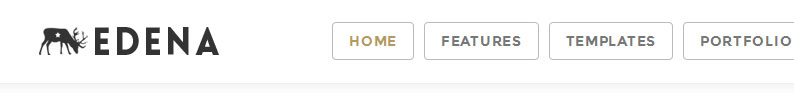
Header
You can change the look and feel of your menu by adding one of the .header-X class to the body.
Styles
Header-1
<body class="header-1">
Header-2
<body class="header-2">
Header-3
<body class="header-3">
Header-4
<body class="header-4">
Header-5
<body class="header-5">
Header-6
<body class="header-6">
Header-7
<body class="header-7">
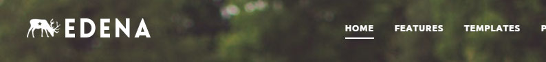
Colors
You can change the background of your menu by adding .dark-header or .light-header class to the body.
Opacity
In combination with .dark-header and .light-header, you can change the background opacity of your menu by adding .header-semi-transparent class to the body.
Note that the "header-6" will always be fully transparent and won't react to the color and opacity classes.
Pre header
Add class .pre-header-on to display the pre-header above the menu..pre-header-on-sm class will hide it on mobile devices.
Pre-header can be styled with .main-color, .dark-main-color, .light-main-color, .light-color and .dark-color classes.
A simple shell for an h1 to appropriately space out and segment sections of content on a page. It can utilize the h1's default small element, as well as most other components (with additional styles).
Title Subtext for header
Color variants
Title Subtext for header
Title Subtext for header
Title Subtext for header
Title Subtext for header
Title Subtext for header
Background image
Add .image-background to display an image background on the header. Add .image-X to select one of the defined image background.
Title Subtext for header
Cras justo odio, dapibus ac facilisis in, egestas eget quam.
Donec id elit non mi porta gravida at eget metus.
Nullam id dolor id nibh ultricies vehicula ut id elit.
Background image with a mask
Add .no-padding to remove the padding on the header. Add a div with a .mask class around the content, finally adjust the mask opacity with opacity-X class.
Title Subtext for header
Cras justo odio, dapibus ac facilisis in, egestas eget quam.
Donec id elit non mi porta gravida at eget metus.
Nullam id dolor id nibh ultricies vehicula ut id elit.
Large
Add .large to the header to set its size in height. Add .v-align-center to the .container to center the content verticaly.
Title Subtext for header
Cras justo odio, dapibus ac facilisis in, egestas eget quam.
Donec id elit non mi porta gravida at eget metus.
Nullam id dolor id nibh ultricies vehicula ut id elit.
Extra large
Title Subtext for header
Cras justo odio, dapibus ac facilisis in, egestas eget quam.
Donec id elit non mi porta gravida at eget metus.
Nullam id dolor id nibh ultricies vehicula ut id elit.
Color and opacity
Add .mask-main-color to the mask to change color. Add .opacity-X to change its opacity.
Title Subtext for header
Cras justo odio, dapibus ac facilisis in, egestas eget quam.
Donec id elit non mi porta gravida at eget metus.
Nullam id dolor id nibh ultricies vehicula ut id elit.
Timeline
Mussum ipsum cacilds
11 hours ago via Twitter
Mussum ipsum cacilds, vidis litro abertis. Consetis
adipiscings elitis. Pra lá , depois divoltis porris,
paradis. Paisis, filhis, espiritis santis. Mé faiz elementum
girarzis, nisi eros vermeio, in elementis mé pra quem é
amistosis quis leo. Manduma pindureta quium dia nois paga.
Sapien in monti palavris qui num significa nadis i pareci latim.
Interessantiss quisso pudia ce receita de bolis, mais bolis eu num gostis.
Mussum ipsum cacilds
Suco de cevadiss, é um leite divinis, qui tem lupuliz,
matis, aguis e fermentis. Interagi no mé, cursus quis, vehicula ac nisi.
Mussum ipsum cacilds
Mussum ipsum cacilds, vidis litro abertis. Consetis adipiscings elitis.
Pra lá , depois divoltis porris, paradis. Paisis, filhis, espiritis santis.
Mé faiz elementum girarzis, nisi eros vermeio, in elementis mé pra quem é
amistosis quis leo. Manduma pindureta quium dia nois paga. Sapien in monti
palavris qui num significa nadis i pareci latim. Interessantiss
quisso pudia ce receita de bolis, mais bolis eu num gostis.
Mussum ipsum cacilds
Mussum ipsum cacilds, vidis litro abertis. Consetis adipiscings elitis.
Pra lá , depois divoltis porris, paradis. Paisis, filhis, espiritis santis.
Mé faiz elementum girarzis, nisi eros vermeio, in elementis mé pra quem é
amistosis quis leo. Manduma pindureta quium dia nois paga. Sapien in monti
palavris qui num significa nadis i pareci latim. Interessantiss quisso pudia
ce receita de bolis, mais bolis eu num gostis.
Breadcrumbs
Indicate the current page's location within a navigational hierarchy.
Separators are automatically added in CSS through :before and content.
Simple pagination inspired by Rdio, great for apps and search results. The large block is hard to miss, easily scalable, and provides large click areas.
Provide up-to-date feedback on the progress of a workflow or action with simple yet flexible progress bars.
Basic example
Default progress bar.
60% Complete
With label
Remove the .sr-only class from within the progress bar to show a visible percentage. For low percentages, consider adding a min-width to ensure the label's text is fully visible.
60%
Animated
Add .active to .striped to animate the stripes right to left. Not available in IE9 and below.
45% Complete
Contextual alternatives
Progress bars use some of the same button and alert classes for consistent styles.
40% Complete (success)
20% Complete
60% Complete (warning)
80% Complete
Stacked
Place multiple bars into the same .progress to stack them.
35% Complete (success)
20% Complete (warning)
10% Complete (danger)
Panels
Panels are some kind of special boxes, from default bootstrap
Basic example
By default, all the .panel does is apply some basic border and padding to contain some content.
Basic panel example
Panel with heading
Easily add a heading container to your panel with .panel-heading. You may also include any h1-h6 with a .panel-title class to add a pre-styled heading.
For proper link coloring, be sure to place links in headings within .panel-title.
Panel heading without title
Panel content
Panel title
Panel content
Responsive embed
Allow browsers to determine video or slideshow dimensions based on the width of their containing block by creating an intrinsic ratio that will properly scale on any device.
Rules are directly applied to <iframe>, <embed>, and <object> elements; optionally use an explicit descendant class .embed-responsive-item when you want to match the styling for other attributes.
Pro-Tip! You don't need to include frameborder="0" in your <iframe>s as we override that for you.


